Varieties of unemployment
This is the first in a series of lbo-news posts about the state of the U.S. job market.
On March 10, when the Bureau of Labor Statistics (BLS) released the employment report for February showing a robust job market, Donald Trump finally liked the numbers. His press agent, Sean Spicer, quoted him as saying “They may have been phony in the past, but it’s very real now.” Trump himself retweeted Matt Drudge’s gloss on the news that employers added 235,000 jobs in the month as proof that America was already “GREAT AGAIN.”
That was a remarkable turnabout from as recently as December when Trump said this:
The unemployment number, as you know, is totally fiction. If you look for a job for six months and then you give up, they consider you give up. You just give up. You go home. You say, ‘Darling, I can’t get a job.’ They consider you statistically employed. It’s not the way. But don’t worry about it because it’s going to take care of itself pretty quickly.
Almost none of that is true, but more on that in a moment. A Washington Post review found that Trump claimed the numbers were “cooked” or “phony” at least 19 times since 2012.
When asked to reconcile these strong claims with Trump’s celebration of the latest batch of numbers, which also showed the unemployment rate dropping 0.1 point to 4.7%, Spicer responded with his usual clarity and thoughtfulness:
I think there’s a question between the total number of people that are employed, and the President’s comments in the past have reflected that his big concern was getting to the bottom of how many people are working in this country, and that the denominator—meaning the percentage rate of the total number of people—is not the most accurate reflection of how many people are employed in this country.
How many jobs are created, how many people are getting back to work, how many companies are committing to hiring more people is a much more accurate assessment of where we’re headed as our country—where our employment is, where our economy is headed.
Aside from not knowing what a “denominator” is, not to mention how to express himself in terms that people can actually understand, Spicer also seems to know nothing about how the employment statistics are constructed.
But when I made the requisite fun of Trump and Spicer on social media, several of my left-wing pals also revealed some misunderstandings of the (un)employment stats. In the interest of accuracy, here are a few observations.
The monthly employment report, typically released on the first Friday of the month, is based on two surveys, one of employers and the other of households. The first, known as the Current Employment Statistics (CES) program, or informally as the establishment or payroll survey, covers almost 150,000 businesses and governments representing over 600,000 worksites. It is the source of the headline jobs number (e.g., “Employers added 235,000 jobs in February”), as well as information on hourly earnings and the length of the workweek. The other is known as the Current Population Survey (CPS), which polls about 60,000 households every month; it’s commonly known as the household survey. It asks respondents whether they were employed during the previous month (during the week containing the 12th, to be specific, known as the reference week); if so, at what kind of work; if not, why not, and did they want a job. It also breaks these numbers down by demographic categories like race, sex, age, nativity, and education. Both these surveys have extremely large samples—a typical opinion poll might survey just 1,000 people—which then get translated into national figures. No survey can ever represent the full universe it’s surveying completely, but these are about as good as surveys can get.
February’s gain of 235,000 in the payroll survey was a bit above the average over the last year of 196,000. But there’s just no way the February number was right and earlier ones were wrong—nothing has changed in the way the figures were gathered or processed. And every quarter, the survey results are compared with the near-full coverage of the employment universe provided by the unemployment insurance (UI) system, and the monthly estimates have been within one- or two-tenths of a percent of the definitive UI numbers. Gallup should be so good at predicting elections.
While the household survey also measures employment, it’s most noted as the source of the unemployment rate. Many people, not just Donald Trump, really don’t understand this number at all. It has nothing to do with whether someone is receiving unemployment benefits, for example; fewer than a third of the officially unemployed are getting checks. The count of the unemployed hinges on the answers that respondents give to the CPS. People are counted as unemployed if they didn’t work at all during the reference week, but only if they’ve been actively searching for work. (Work for pay, that is; even the “unemployed” often do plenty of unpaid work.) You need only work an hour to be counted as employed. If you’re not looking for a job, you’re considered to have dropped out of the labor force.
That minimalist definition of employment, along with the requirement that you search for work to be counted as officially jobless, is often criticized as a ridiculously loose standard. It would be if the unemployment rate were meant to be a measure of human deprivation. But it’s not—it’s really a measure of labor market tightness. Employers want to know just how desperate or demanding workers will be. When jobs are easy to find, the help wants higher pay and nicer working conditions; when jobs are hard to find, employees will take whatever the boss wants to shove down their throats. The unemployment rate is a measure of the balance of class forces between capital and labor. People who are neither working nor actively looking for work—who are outside the labor force by the official definition—are near-irrelevant to calculating that balance of forces.
But the BLS also calculates a broader measure of unemployment, one that does a much better job of measuring deprivation. It’s called the U-6 measure, the broadest of the six measures of unemployment that it publishes. (The headline rate is called the U-3. For a history of these measures and detailed explanations, see here.) The U-6 rate includes “discouraged” workers—people who want a job but didn’t search in the last month but did within the last year—and half those who want full-time work but can only find part-time. In February 2017, the U-3 rate was 4.7%, the U-6, 9.2% Here’s a graph of both since 1994, when the current series began.
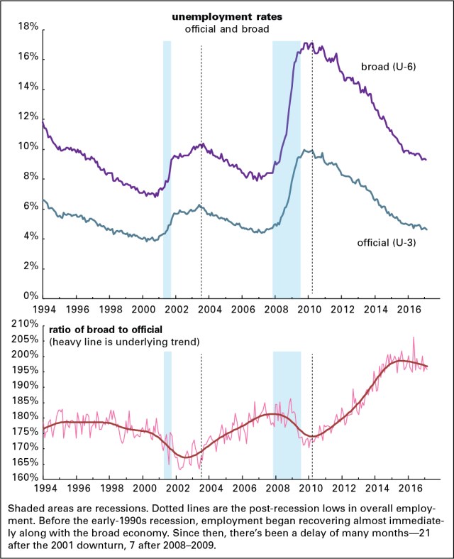
The graph on the bottom is the ratio of the two rates, along with a line capturing the underlying trend of the volatile monthly numbers. A couple of things stand out from that graph: one is that the ratio falls during recessions (though we only have a sample size of two since 1994), and the other is that it rose during the weak 2002–2007 expansion, as well for most of the recent (also weak) expansion. (The trendline also rose from 1994–1996, the adolescent years of the 1990s expansion.) It rises in expansions because the U-3 unemployed find work more quickly than the U-6 unemployed, and falls in recessions because as people are laid off they join the U-3 ranks, swelling them relative to the U-6. But as an expansion goes on, it finally draws some of the U-6 crowd into the job market.
The ratio fell for several years in the late 1990s, which featured the strongest labor market in a generation. More recently, it started falling in late 2015. One way to read these declines is that it takes a really long expansion to draw in people on the margins of the labor market. A more pessimistic way of reading it is that that only happens as an expansion is approaching the end of its life. One hopes that we’re not in a similar place now.
But let’s return to Sean Spicer, and his word salad around the word “denominator.” It’s likely that what he had in mind was two things called the employment/population ratio (EPOP), the share of the adult (over-16) population in paid employment, and the labor force participation rate, the share of that population either working or looking for work. Those give a much less upbeat picture of the job market than the unemployment rate, as the graph below shows.
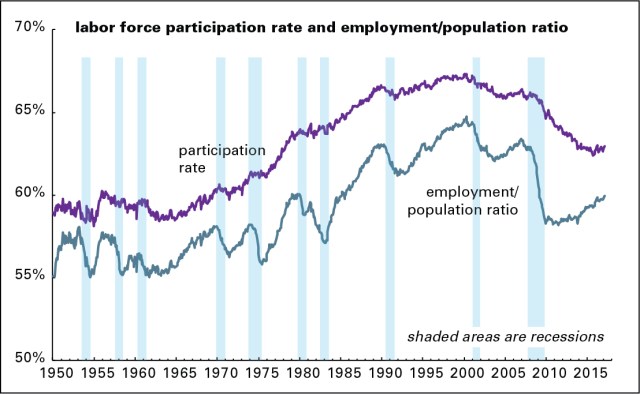
Even though the unemployment rate is close to its 2000 and 2007 lows, both these measures are considerably weaker. The reason is that millions of people have dropped out of the labor force since the Great Recession. Part of the reason for this is that the population is aging; older cohorts are less likely to be in the labor force and older boomers are retiring. But that only explains about half the decline. I’ll have more to say about all this in the next installment of this series.

