Measuring the carnage
When Trump promised to end “American carnage” in his inaugural address, he had no idea he’d end up presiding over mass death and economic collapse, but history can be a brutal ironist. Here’s a look at the bloodletting in the job market, which is central to most people’s economic well-being.
Most of the time, the monthly employment report from the Bureau of Labor Statistics is of interest mostly to econogeeks, but the April 2020 edition, released on Friday, May 8, was like no other since the end of World War II. The scale of job loss and the rise in unemployment had nothing even remotely like a precedent.
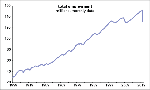
Employers axed 20.5 million jobs in April, making for a decline of 12.9% from a year earlier. That annual loss is a record by a wide margin. The previous record was -7.6% in September 1945, during the postwar demobilization. Total employment is back to where it was in February 2011, which was itself back to March 2004 levels, thanks to job losses in the Great Recession (a name that might have to be retired) and its aftermath. And that March 2004 level was the same as February 2000’s, because of the 2001 recession and the jobless recovery that followed it. So, employment now is the same as it was 20 years ago even though the adult population is up 48.3 million, or 23%. (See graph below.) We’re almost certain to see giant losses for May when the numbers are released on June 5.
Almost every sector and subsector lost jobs, and lots of them. Manufacturing lost 1.3 million; retail, 2.1 million; professional and business services, 2.1 million; education and health, 2.5 million (including 1.4 million in health care, a bizarre development during a massive health crisis); and leisure and hospitality, dominated by bars and restaurants, 7.7 million. Government was off almost a million, all of it at the state (-180,000) and local (-801,000) levels. It’s distressing that at a time when people need public services, they’re being radically shrunk, and a sector that is supposed to counter recessions by maintaining stable employment is acting instead as a downward accelerant. During the worst phases of the Great Recession, state and local government employment declined at an annual rate of around 1.5%; April’s level was off 4.5% from a year earlier. Austerity at the state and local level undermined the early Obama stimulus package, and continued as a drag on growth throughout the expansion.
Weirdly, average hourly earnings rose an eye-popping 4.6%—for the month, not the year, over 15 times the 2018–2019 average. The reason is that job losses are concentrated among lower-paid workers, which pushed up the average. It’s likely job losses will climb up the income ladder in coming months.
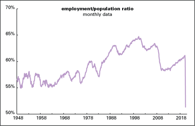
These figures come from a survey of employers, known as the establishment survey. The BLS also conducts a survey of people, known as the household survey. It was, if anything, even grimmer than its establishment counterpart. It found job losses a million higher (the two surveys often differ in the short term, though they always wind up telling the same basic story). The employment/population ratio, the share of the adult population working for pay, cratered, falling from 60.0% in March to 51.3% in April, an all-time low. (See graph below.) In the 1950s, before the mass entry of women into the labor force, it occasionally got as low as 55%. Its all-time high was 64.7% in April 2000. It never got anywhere near that high again, either in the early 2000s or in the 2009–2019 expansion, because of a mix of an aging population and weak economic growth. If people were employed at that rate now, there’d be almost 35 million more working.
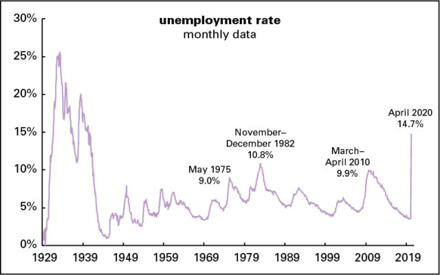
Unemployment soared, the rate rising more than 10 points from 4.4% to 14.7%. As the graph below shows, that’s well above previous peaks since the end of World War II. It took almost two years after the 1929 stock market crash for unemployment to hit 15%; we’ve done it in two months.
The BLS reports a fairly obscure set of stats called employment flows, which measure moves in and out of employment and unemployment. They report that almost one in six people who were employed in March lost their jobs in April.
As sharp as the April increase was, it was partly masked by massive labor force withdrawal. You have to be actively looking for work to be counted as unemployed, and no doubt some people either saw no point in searching, or no way to do it with so much shut down, so they weren’t counted as unemployed. Also, as the BLS reported, many people who were actually laid off reported themselves as “absent from work.” Had they reported themselves as laid off, the unemployment rate would have been close to 20%.
The BLS also reports a broader measure of unemployment, called U-6, which includes people who are working part-time who want full-time work and those who’ve given up the job search as hopeless. That rose from 8.7% to 22.8%, shattering its previous record of 17.2%, set in April 2010. The histories of the headline unemployment rate, aka U-3 (the one discussed in the previous paragraph) and the broad U-6 rate are graphed below. Also shown is a predecessor of the U-6 rate, known as U-7, which was reported from 1970 through 1993. The pure verticality and magnitude of the April spikes read like a poke in the eye.

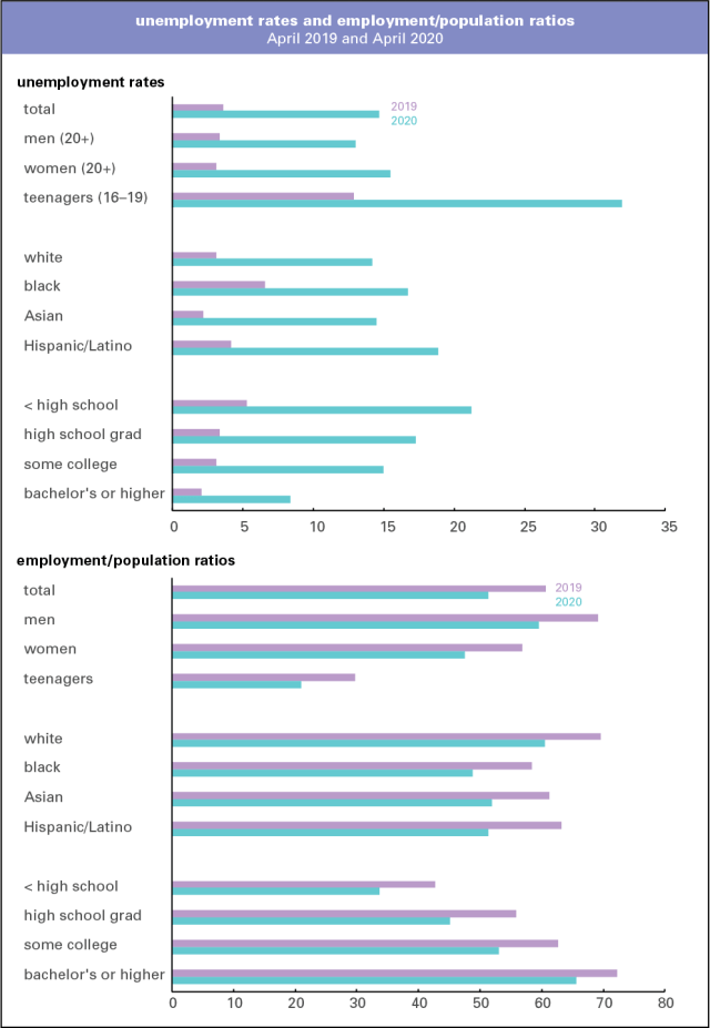
Of course, employment and unemployment vary widely by demographic, as the graphs below show. While every category saw a sharp rise in unemployment and fall in employment, the white and educated started from better positions and remain there. But things stink for them too.
If you’re desperate to find a cheering note buried amidst all the red ink, almost all the unemployed report themselves as being on temporary layoff rather than as permanent job losers. Similarly, a Washington Post–Ipsos poll reports that 58% of laid-off workers think it’s “very likely” they’ll get their old jobs back, and another 19% say it’s “somewhat likely.” One hopes this is based on sound reasoning and not wishful thinking.
Judging from the behavior of the stock market, which has recovered much of the ground it lost in the sharp selloff in February and March—and which is actually slightly above where it was a year ago—Wall Street thinks this damage is a brief bit of unpleasantness that will soon pass and come fall, it’s back to the races. I don’t get this. Thousands, maybe millions, of small and mid-sized businesses won’t be able to survive months with no revenue, and so won’t be around to reopen. Second and/or third waves of viral attacks, which are quite possible, would make a quick rebound even less likely. We’re in lots of trouble, and no one in charge knows how to get us out of it.
Data note The monthly unemployment figures for 1929–1938 were assembled by the National Industrial Conference Board, predecessor of today’s Conference Board, a think tank and data shop. They’re available from the NBER. The modern employment statistics system originated in the late New Deal, as a project of the Works Progress Administration.

