Miserable numbers
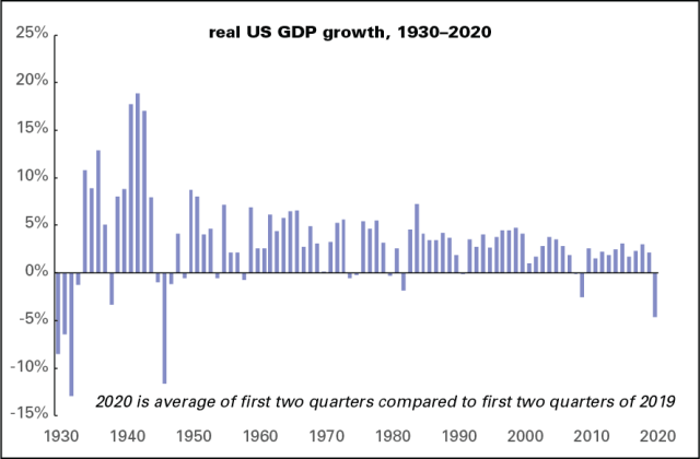
Even non-connoisseurs are reeling from the miserable second quarter GDP numbers released this morning. Between the first and second quarters of this year, GDP was off 33% after adjustment for inflation. That’s by far the biggest decline since quarterly numbers begin in 1947.
That 33% figure is at an annualized rate, meaning GDP would be off by a third if it declined at the second-quarter rate for a full year. The US is unusual in annualizing the data; most other countries report the quarter-to-quarter change without annualizing it. If we did that, it would have been off a mere 9.5%. But no matter how you slice it, it’s awful: more than three times as bad as the previous record, the first quarter of 1958 (a recession that helped elect JFK), and four times as bad as the worst quarter of the 2008–2009 recession, the fourth of 2008.
If you average the first two quarters of this year and compare them to the first two of last year, as the graph below does, you get by far the worst number since 1946, when the US was demobilizing after World War II. Aside from that, you’d have to go back to the Great Depression for bigger negative numbers.
As I’ve pointed out elsewhere, we never really recovered from the 2008 recession. Quoting that to save some keystrokes:
Had the economy continued to grow in line with its 1970–2007 trend, GDP would be about 20% higher than it is now. GDP is a deeply flawed measure; it says little about distribution or quality of life, but it is what the capitalist system runs on. Listen to any pundit or propagandist, and growth is what the whole set-up is all about. And by this most conventional of measures, American capitalism is failing badly on its own terms.
But that 20% shortfall was based on first quarter numbers; the second quarter took it close to 30%, as the graph below shows.
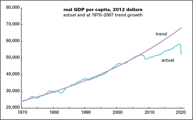
A near-30% shortfall works out to just over $18,000 per person. That’s an aggregate number; it doesn’t mean that we’d each be $18,000 richer had growth held to the old trend. There are things in GDP like investment and government spending that don’t translate into personal income—and since the rich have hogged most GDP growth over the last several decades, the average person would see little of that $18,000. But it is a measure of how much poorer we are as a society because of the economic troubles of the last decade.
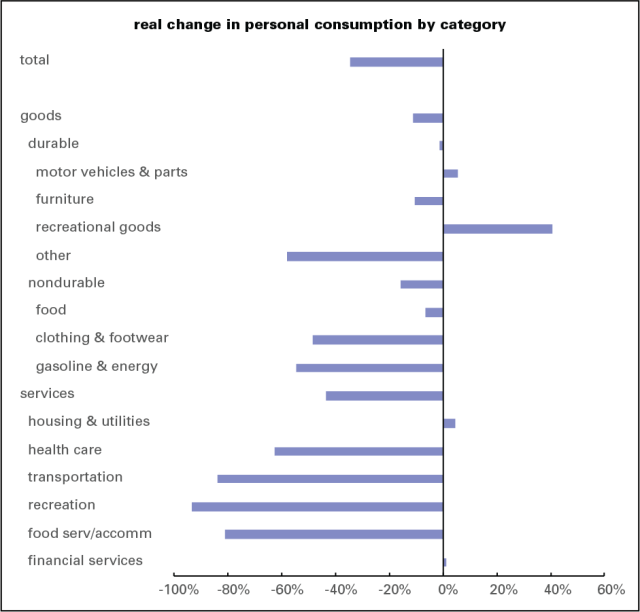
Of the 33% annualized decline in GDP, 25 points came from personal consumption, three times the previous worst quarter (the fourth of 1950). That decline in spending came despite the huge boost to personal income provided by the $1,200 stimulus checks and expanded unemployment benefits; it looks like those who could saved their money out of fear it would soon be in very short supply. As the graph below shows, spending on recreation led the way down, off 94%; close behind were transportation, off 84%, and food services and accommodation, off 81%. Spending on clothing & footwear and gasoline & energy were also down hard. Amazingly, spending on health care was down 63%, as people postponed routine care out of fear of catching the virus.
The third quarter is unlikely to be this dire. According to the Federal Reserve Bank of New York’s GDP tracker, the third quarter is likely to see a sharp rebound—though that’s based largely on early July data. Things look to have slowed as the month progressed—and with the $600 supplemental unemployment benefits gone, at least for now, we could just flatline for a few months. Even if we see some recovery, the long-term damage—people disemployed, businesses shuttered, confidence hammered—will be substantial and lingering.
What a terrible time to be governed by callous morons.

