GDP etc. in a deep funk
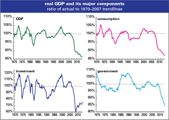
By the way, here’s a graph of actual real U.S. GDP and its major components relative to their long-term (1970–2007) trendlines through the end of 2013. Note how things fell off a cliff in the recession. GDP, consumption, and government spending are all about 15% below where they’d be had they continued to grow in line with their long-term trend. (The hysteria over out-of-control government spending looks ludicrous in the light of this graph.) Investment is about 25% below where it “should” be. thanks largely to the housing collapse, though it’s staging something of a recovery. The other components have yet to begin closing the gap, because the recovery’s been so weak.


Those are useful graphs Doug, thanks, but I don’t know how you produced them, because how did you calculate the 1970-2007 trend line? In my Phd studies in 1987 I looked at the difference between actual GDP and what real GDP would have been, if it had continued to grow at the same average rate it did in 1947-1973 (the average rate was about 4%). I don’t think it makes so much sense to use 1970-2007 as a basis for the trend line, since that period already covers different era’s of slower and faster growth.
Trend lines are pretty crude measurements but this one just highlights how weak the recovery has been.