Union density: yet another low
Preparing to write up the 2019 union density statistics from the Bureau of Labor Statistics, I looked at last year’s and was tempted just to copy–paste. Here’s the lede, as we say in journalism:
Union density—the share of employed workers belonging to unions—fell to 10.5% in 2018, the lowest since the Bureau of Labor Statistics began reporting the data in its modern form in 1964, down from 2017’s 10.7%.
The only edit I’d have to make in this bit is to change “10.5% in 2018” to “10.3% in 2019.” Similar things could be said for subsequent sentences. Union membership for private sector workers fell 0.2 point to 6.2% and 0.3 for the public sector, to 33.6%. (See graph below.) The private-sector number is an all-time low, and down almost 30 points from its 1953 peak, and below the level in 1900 (though that number must be taken with several grains of salt). The public figure is the lowest since 1978, which was at the tail end of a five-year surge in membership; it’s down over 5 points from its 1994 peak.
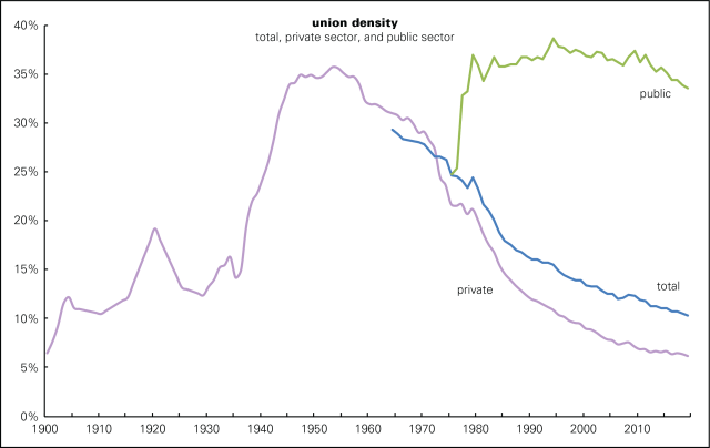
Though public sector density drifted lower for years after that peak, the slide accelerated after 2011, the year Wisconsin governor Scott Walker launched his war on the state’s public sector unions by allowing members to opt out of membership. Other states followed suit, like Michigan in 2013 and Ohio in 2016. Then, in 2018, in the Janus case, the Supreme Court declared that public sector workers nationwide could not be required to pay union dues. These moves have achieved the desired results, and probably have a lot more to run.
Another bit I’m going to copy–paste from last year (click here and scroll down a screen or two to see the graph):
There’s an old lie that unions are good for white men and no one else. That’s the opposite of the case. As the graph below shows, black women, for example, earn 63% as much per week as white men overall; belonging to a union brings that up to 78%—still a large gap, but a much smaller one. Nonunion Latinas earn 60% as much as white men; a union brings that up to 83%. And, as a team of researchers from the Economic Policy Institute argues, unions can raise the level of nonunion workers if they’re prevalent enough in a geographical area or industrial sector. No wonder employers hate them.
As the map below shows, there are strong geographical patterns to union membership, with organized labor strongest in the Northeast, Upper Midwest, and Pacific Coast, and weakest in the South and Mountain West. At the bottom are the Carolinas, where just over 2% of workers are unionized, a tenth the share of Hawaii and New York, the top states.

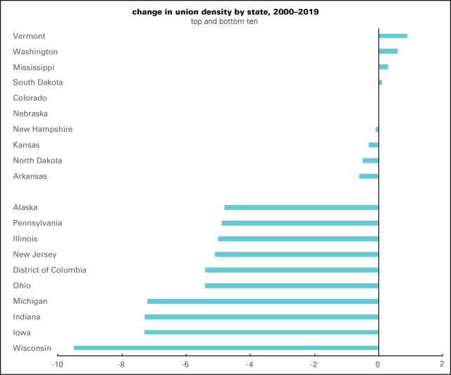
Yearly changes in membership at the state level are pretty noisy, but a longer-term look is revealing (graph below). Only four states saw gains between 2000 and 2019, and those were tiny. Vermont, the champ, was up all of 0.9 percentage point (though that still didn’t reverse the decline between 2015 and 2018). By the time you get to number seven, you’re talking small declines. At the bottom of the ranking, losses were many times larger, with Wisconsin, Michigan, and Ohio among the biggest losers.
And this is more than ten years into an economic expansion, during which the unemployment rate has been under 4% for 18 of the last 20 months. Yes, I know there’s a lot wrong with the job market, but this is about as good as it’s going to get. Come the next recession and the decline is likely to be worse as corporations and governments look to cut costs.
There are a lot of things wrong with American unions. Most organize poorly, if at all. Politically they function mainly as ATMs and free labor pools for the Democratic party without getting much in return. But there’s no way to end the 40-year war on the US working class without getting union membership up, so these density stats are nothing but bad news.


Reblogged this on 21st Century Theater.