Misreading the latest jobs numbers
Z Communications’ resident statistician Jack Rasmus is out with some fresh disinformation about the economic news. It’s been a while since I took his nonsense apart, so this seems like a good opportunity, since his latest looks to be making the rounds.
The problems start in the first paragraph (Rasmus is in quoted italics, my comments in Roman.)
The just released report on April jobs on first appearance, heavily reported by the media, shows a record low 3.6% unemployment rate and another month of 263,000 new jobs created. But there are two official US Labor dept. jobs reports, and the second shows a jobs market much weaker than the selective, ‘cherry picked’ indicators on unemployment and jobs creation noted above that are typically featured by the press.
There’s actually one monthly report , “The Employment Situation,” though it’s based on two surveys. One survey is of employers, the other of households. The first, also known as the establishment or payroll survey (details here), covers “142,000 businesses and government agencies representing approximately 689,000 worksites.” The other, known as the household survey (details here), covers some 60,000 households. Rasmus doesn’t seem to know that the “second” survey, which he apparently views as more accurate, is the source of the unemployment stats. There’s no cherry-picking involved here.
Since the establishment survey is much larger than its household counterpart, it’s far more accurate. To get a statistically significant change in employment in the establishment survey, you need a move of 100,000 or more; for the household survey, you need 500,000. Numbers from the household survey tend to be far more volatile than the establishment numbers, so one month moves in the household stats are fairly meaningless.
While the Current Establishment Survey (CES) Report (covering large businesses) shows 263,000 jobs created last month, the Current Population Survey (CPS) second Labor Dept. report (that covers smaller businesses) shows 155,000 of these jobs were involuntary part time.
The CES, another name for the establishment survey, doesn’t cover just large businesses. It is a survey, though a very large one, and therefore is subject to error—it might miss new firms, or rapidly growing ones. As a check on that, every three months it’s compared with records from the unemployment insurance system, which covers almost everyone in formal employment. It’s rarely off by more than a tenth of a percentage point or two.
The CPS, another name for the household survey, doesn’t cover small businesses—as its name suggests it covers households. In other words, it asks people if they worked last month, if they wanted to but didn’t, what they did, and questions like that. And yes, the number of people working part-time for economic reasons (the official name for the category) rose by 155,000. Over the last year, however, that number is down by 255,000. Involuntary part-time work accounts for 3% of employment (see graph below). That’s way down from the recession peak of close to 7%, but a bit above its lows in the strong job market of the late 1990s/early 2000s. According to the economist Danny Blanchflower, that stickiness may be a reason that wages aren’t rising smartly despite a low headline unemployment rate—the job market isn’t as tight as it looks. But it’s not as weak as Rasmus wants to believe either.

This high proportion (155,000 of 263,000) suggests the job creation number is likely second and third jobs being created. Nor does it reflect actual new workers being newly employed. The number is for new jobs, not newly employed workers. Moreover, it’s mostly part time and temp or low paid jobs, likely workers taking on second and third jobs.
It’s bad form to make month-to-month comparisons between the two surveys, because the household version is quite volatile, and even the establishment count is not free of statistical noise. In any case, the popular claim that many people are holding down multiple jobs has no basis in fact. Here’s a history of multiple jobholding; it’s down from 1990s levels, and has been pretty flat since the job market bottomed out in 2010.

Even more contradictory, the second CPS report shows that full time work jobs actually declined last month by 191,000. (And the month before, March, by an even more 228,000 full time jobs decline).
See above re: volatility of the household survey from month to month. Over the year ending in April, full-time employment was up almost 2 million; part-time for all reasons, both voluntary and involuntary, is down 188,000.
The much hyped 3.6% unemployment (U-3) rate for April refers only to full time jobs (35 hrs. or more worked in a week).
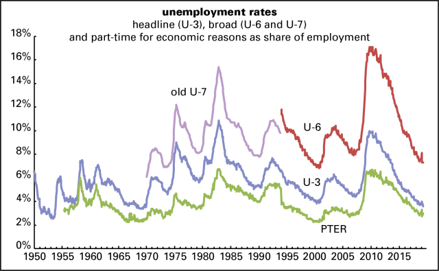
No, the U-3 rate—the headline rate that’s most commonly cited—refers to work of any kind, not just full-time. A common, and justified, criticism of that rate is that you only have to have worked an hour in the previous month to be counted as employed, and to be counted as unemployed you have to have actively looked for work. There’s a broader definition of unemployment, the so-called U-6 rate, that accounts for people who want full-time work but can only find part-time and for those who’ve given up the job search as hopeless (“discouraged” workers). That was 7.3% in April, a bit higher than the 6.8% low in late 2000, and a lot higher than the U-3 rate.
Here’s a graph of the U-3 and U-6 rates, along with the old U-7 rate (a predecessor to the U-6 rate which the U-6 replaced in January 1994) and the share of the employed working part-time for economic reasons. The overall picture is pretty good, but not the best ever, as the Tweeter-in-Chief claims.
Looked at another way, employers may be converting full time to part time and temp work, as 191,000 full time jobs disappear and 155,000 part time jobs increase.
A repetition of the same pair of bad numbers joined to another canard: the proliferation of temp work. Here’s temporary employment as a share of the total. It rose steadily from the early 1980s through the late 1990s, and has been more or less flat ever since, declining around the 2001 and 2008 recessions, and rising in expansions to a peak of around 2%. It’s barely changed for five years.

This graph only shows employment arranged through temp firms. For other forms of contingent labor, like contract and on-call work, see here, here, and here. Spoiler: it’s nowhere near as big a deal as the likes of Rasmus would have you believe.
And there’s a further problem with the part time jobs being created: It also appears that the 155,000 part time jobs created last month may be heavily weighted with the government hiring part timers to start the work on the 2020 census–typically hiring of which starts in April of the preceding year of the census. (Check out the Labor Dept. numbers preceding the prior 2010 census, for April 2009, for the same development a decade ago).
No, they’re not yet hiring temporary Census workers in quantity. They hired 1,000 in February, and none since. That will change in the coming months, but they’ll be noted in the monthly statistical release.
The April selective numbers of 263,000 jobs and 3.6% unemployment rate is further questionable by yet another statistic by the Labor Dept.:
Rasmus is the one doing the selection of numbers here.
It is contradicted by a surge of 646,000 in April in the category, ‘Not in the Labor Force’, reported each month. That 646,000 suggests large numbers of workers are dropping out of the labor force (a technicality that actually also lowers the U-3 unemployment rate). ‘Not in the Labor Force’ for March, the previous month Report, revealed an increase of an additional 350,000 added to ‘Not in the Labor Force’ totals. In other words, a million–or at least a large percentage of a million–workers have left the labor force.
This is closer to an accurate point, though, again, a monthly move of 646,000 is not conclusive in itself. Over the year ending in April, the labor force (which consists of the employed plus those actively looking for work, that is, the U-3 unemployed) grew by 919,000.
Where Rasmus approaches making a real point, though one that eludes him because of a lack of skill and knowledge, is that a smaller share of the population is working or looking for work than in past expansions. Here’s a graph of the labor force participation rate (the share of the adult population either working or looking for work) and the employment/population ratio (the share of the adult population that is working for pay) over time.
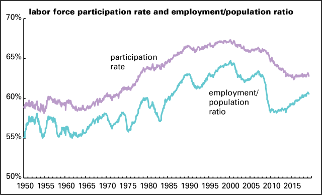
The participation rate fell gently in the early 2000s, then hard in the 2008 recession and its aftermath, and has barely risen since. The employment/population rate fell hard during the recession and, despite a sustained rise, hasn’t returned to its 2007, pre-recession level. (And that peak was below 2000’s all-time high.) Part of this can be explained by the aging population—but not all. If the population had the same age structure as it did in 2000—before the mass of baby boomers started becoming eligible for AARP membership—the employment/pop ratio would be about 3 percentage points higher, closer to 64% than April’s 61% (rounding to the nearest whole numbers). That would still be short of the April 2000 record high of 65%, but 1 percentage point below, not 4. That translates into a shortfall of about 2.5 million jobs, which is equal to the past year’s job growth. So there are more people on the sidelines than a 3.6% unemployment rate suggests, which is almost certainly a lingering effect of the Great Recession, whose damage persists more than a decade after its onset.
Another point: these employment stats don’t cover people in prison, which we have in scandalously great quantity. To put that into perspective, were the 2 million people behind bars all in the labor market and unemployed—which wouldn’t be the case, but we’re just testing things out here—the unemployment rate would be 4.8%, not 3.6%.
Back to Rasmus. An awful lot of Americans have a hard time getting by. Many are working dull, even dangerous, jobs, for stagnant pay and disappearing benefits. There’s strong support for that story. But unless you want to discredit yourself, there’s no point in making a lot of less-than-half-baked claims.


Here we go again. Henwood the apologist for government stats and bureaucrats. I’ll reply in detail to his misrepresentations on my own blog and other public sources. But here’s just one: Henwood says the U-3 unemployment rate covers all workers not just full time. He should know that part time is addressed in the U-4 to U-6 stats that are typically not reported by the press. Here’s another misunderstanding he has of the two surveys (yes, contained in the one report but in different tables, A and B): the CPS survey is a household survey but it picks up small business employment. The CES is larger businesses that do not. I could go on (and on) with his misrepresentation of my views, but I’ll leave that to other sources so they too can see how Doug has become (or always was) a shil for government stats and his buddies over there at the Labor Dept.
You leave me speechless with your idiocy. You clearly don’t know the first thing about how the stats are gathered or what they mean. I’m guessing you never spoke with anyone at the BLS or another stat agency and found that they’re serious people, open about their work, who want to do a good job.
Yes, the CPS picks up small-business employment. It also picks up big and medium-business employment. And government too! All forms of employment. Farms even, if you include the ag workers.
I work for the Census Bureau. Jack’s attacks on government statisticians is disgusting. Workers at Census (which administers the CPS on behalf of BLS) and other government agencies continue to serve the American people regardless of what administration is in power. If that administration chooses to highlight favorable statistical reports, it does not mean that the workers in the agencies that produce them agree with the spin or have tailored reports to serve his interests. We fight every day to protect the integrity of the data we produce and how they are reported. You can download your own version of the CPS monthly data, follow the same algorithms used at BLS to produce the reported rates, and then change your definitions to come to your own conclusions based on your priors. It sounds as though Jack has attempted to do this via a misreading of the report, but has a poor understanding of what each data set brings to the story and how each rate is produced.