Wild times in the job market
Millions of unfilled job openings, workers quitting en masse, soaring wages (at least in some sectors)—wild time in the job market. Here are some graphs to make the point.
The Bureau of Labor Statistics does a monthly Job Openings and Labor Turnover Survey (JOLTS) that queries employers on unfilled openings, hires, firings, and quits. August’s data was released this morning, October 12.
Here’s a graph of openings, expressed as a percent of current employment, in the private sector as a whole and in accommodations and food services (hotels, casinos, restaurants, and bars, hereafter AFS), the sector that’s grabbed a lot of attention as a site of worker discontent.
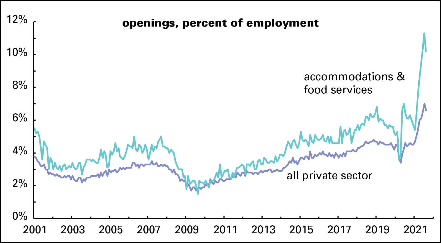
Although the openings rate came down in August from July’s all-time high, we’ve never seen anything like it since the survey began in December 2000. (The graph starts in January 2001 for appearance’s sake.) Overall private-sector openings were 6.6% of employment—and at 10.2%, the AFS sector was even more extraordinary than the overall rate.
And a lot of workers are quitting. No downturn in August here: the two graphed quit rates—3.3% overall and 6.8% in AFS—set records by a comfortable margin.
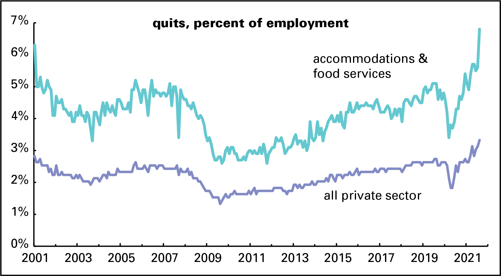
The quit rate got very low during and after the Great Recession, roughly 2008–2010; when the world is falling apart, workers are generally reluctant to leave their jobs. The quit rate is usually read as a sign of worker confidence. Bosses and financiers don’t like it when workers get too cocky—it makes them harder to push around—so central bankers often push the economy into recession in order to readjust their attitudes. The quit rate’s behavior lately, though, seems less about an economic boom making workers cocky and more about them losing patience with shitty jobs (especially in AFS) where supervisors often scream, pay stinks, covid is rampant, and customers threaten to punch you out for asking for proof of vaccination.
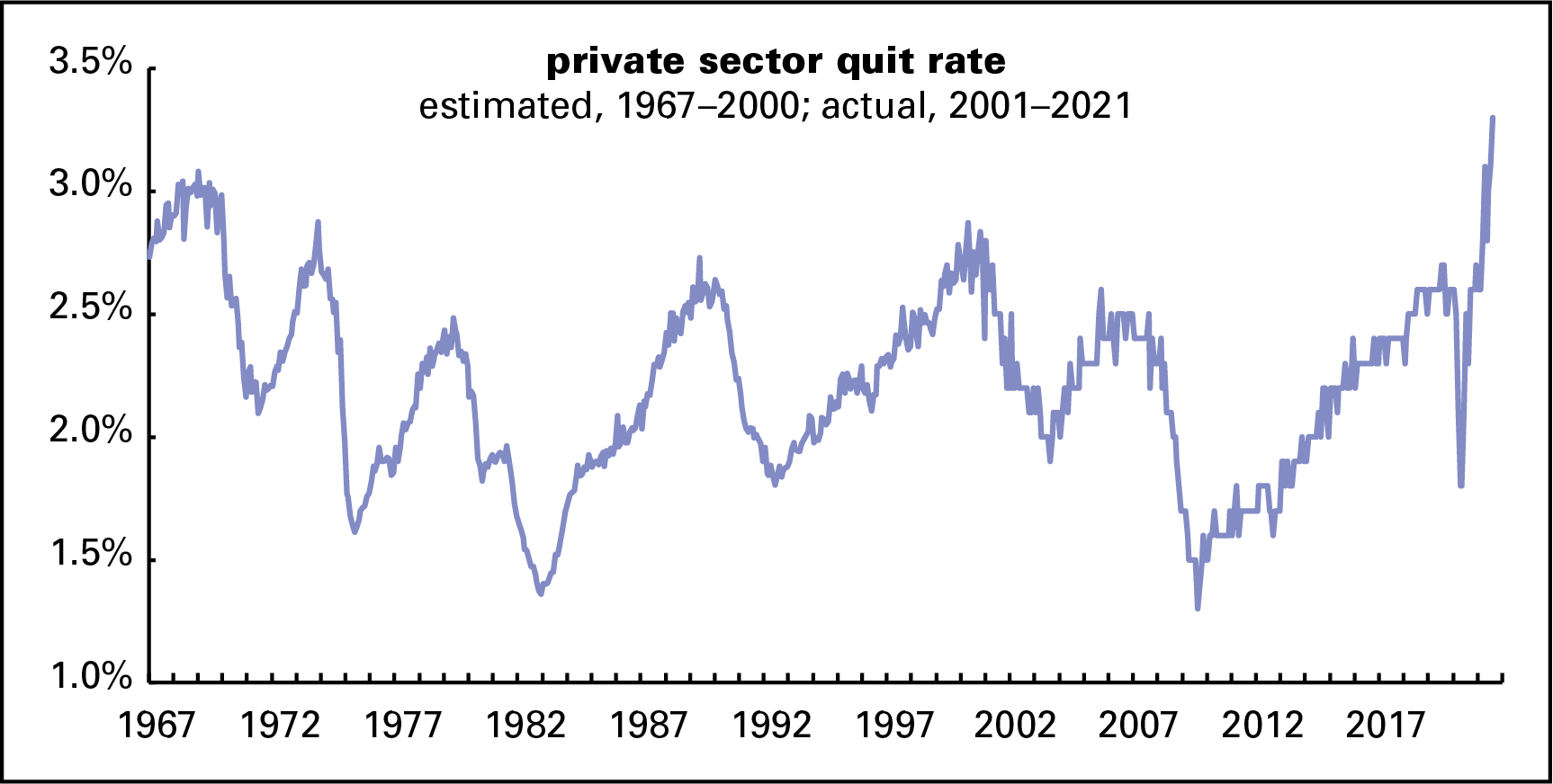
Here’s a longer-term perspective on the quit rate. Pre-2001 data are estimated from the share of job leavers among the unemployed (a figure reported every month with the employment release). As the graph shows, it looks like the August record would hold even if you take it back 54 years.
Employers look to be boosting pay in an effort to lure workers back on the job. Here’s a graph of the annual change in average hourly earnings (AHE) for all private sector workers and AFS. There are a lot of gyrations at the right end of the graph that need explanation. When the pandemic first hit, the AFS sector largely shut down, so the wage data covered a fraction of the sector’s usual employees. That strangeness is visible in the dip of the light blue (turquoise?) line into negative territory. More broadly, low wage workers were far more likely to lose their jobs than higher-wage ones. That made for a spike in AHE largely driven by this compositional effect (as economists say). As they returned, wages appeared to dip, but it was just the flip side of the compositional effect.

But recent behavior looks not to be driven by compositional effects, but by the elusiveness of hirable workers. For the year ending in August, hourly earnings in AFS were up over 15%—like nothing we’ve seen before. Wages for the broader workforce are up just 5.5%—high by the standards of the last 30 years, but nothing like they are in AFS.
Sadly, though, that 5.5% increase is equal to the current rate of inflation, meaning that real wages are essentially unchanged. But hotel and restaurant workers look to be booking gains well ahead of inflation, at least for now.

