How recovered is the job market?
Between February and April 2020, the US economy lost over 22 million jobs, almost 15% of total employment. That was by far the largest job loss since the early years of the Great Depression. Between 1929 and 1932 or 1933 (depending on whose numbers you use, since there are no solid, official stats), 20–25% of jobs disappeared (again, depending on whose numbers you use). Since World War II, however, the worst contraction, the Great Recession of 2008–2009, killed just over 6% of all jobs—a big number, but well short of 15%.
Since April 2020, we’ve recovered just over three-quarters of the jobs lost early last year. That’s a healthy chunk, but it still leaves employment over 3% below February 2020’s level, a loss that that would qualify as a sharp recession in more normal times. The recovery remains highly incomplete.
I haven’t mentioned unemployment as a measure of labor market damage because it tells only a partial story. To be counted as unemployed, you have to be actively looking for work, and many people just aren’t looking, either out of discouragement or disgust with the jobs on offer. The labor force—the sum of the employed and the officially unemployed—is over 3 million, or 2%, smaller than it was before covid hit. While the unemployment rate of 4.8% in September isn’t terrible by historical standards, and is well below April 2020’s peak of 14.8%, the 3+ million who’ve withdrawn from the labor force wouldn’t be properly accounted for. In any case, we’re still a long way from February 2020’s 3.5%.
A better measure than unemployment under these circumstances is the employment/population ratio (EPOP), the share of the adult population employed for pay. It was 61.1% in February 2020, fell almost 10 points to 51.3% two months later, and has since recovered to 58.7% as of September. Again, it’s a substantial but still very incomplete recovery. That 58.7% neighborhood was around where the EPOP was in the depths of the Great Recession.
Of course, the trajectories of job loss and subsequent recovery vary by demographic. The graphs below, known as spiders in the trade, are not as familiar a form as line, bar, or pie graphs, but they’re a very useful way to depict the job loss and recovery of the last year and a half. Let’s start by indexing the level of the EPOP for each demographic group in February 2020 to 100. That number isn’t meaningful in itself—it’s just a way of comparing subsequent levels to that starting point. The outside ring, the light blue (turquoise? this site says it’s “downy”) represents that 100 for all demographic groups. The innermost ring, the violetish one (or “east side” according to that same site), represents the April 2020 lows. And the dark blue, or “wild blue yonder,” represents September 2021, the most recent month available.
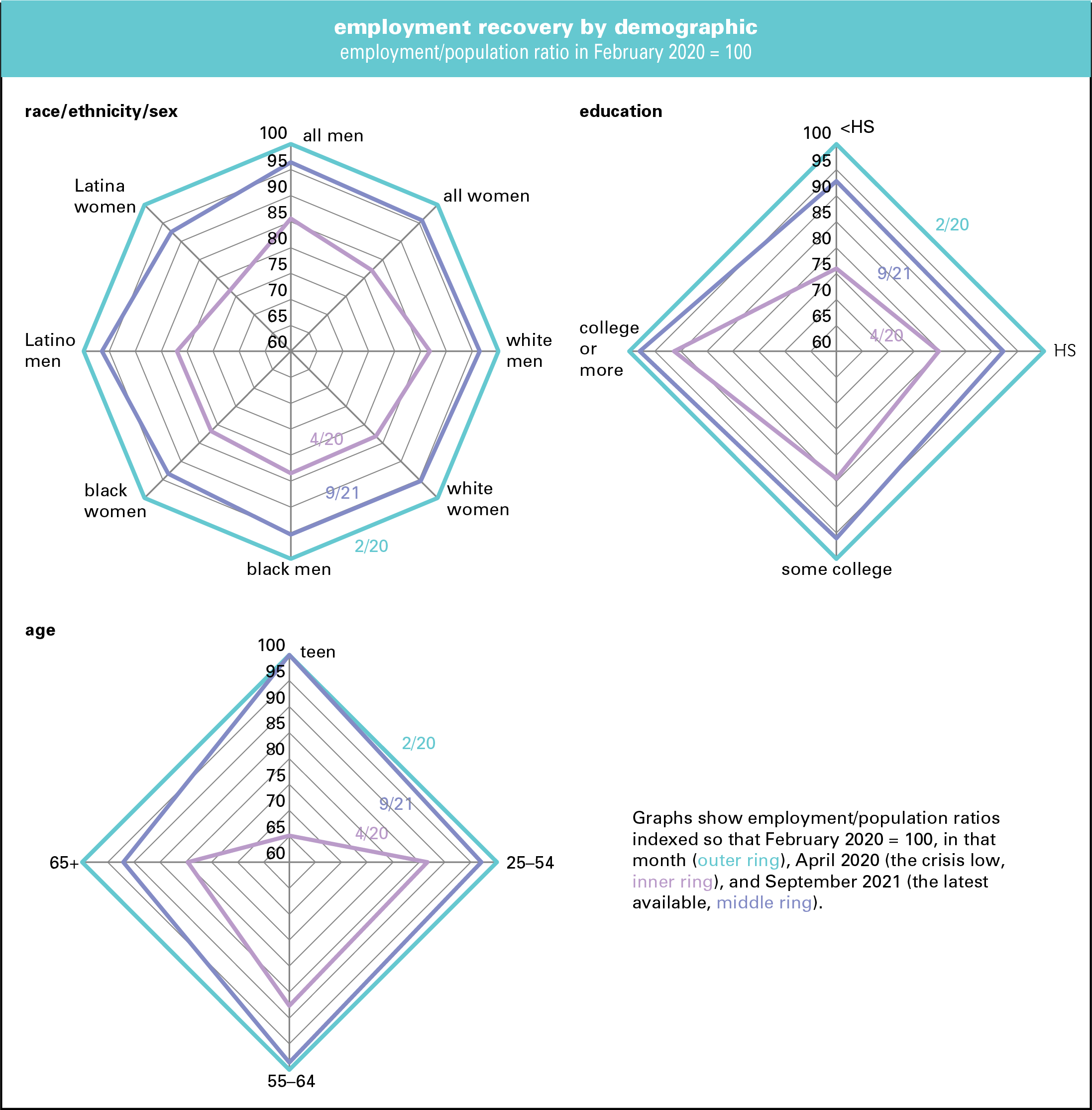
It’s no surprise that job losses were very unequally distributed. The EPOP for everyone fell from 61.1% in February 2020 to 51.3% two months later, a decline of 16%. (That’s not graphed. Note that that 16% decline refers to the change from 61.1% to 51.3%, a decline of 16%, which is different from the 9.8 percentage point decline.) For men, it went from 66.8% to 57.2%, or a decline of over 14% (again, the percent change from 66.8 to 57.2, not the 9.6 point decline derived by subtracting 57.2 from 66.8). That loss is visible on the inner ring of the graph on the upper left, where the graph along the “all men” axis hits 86. For women, the decline was steeper—almost 18%, which is graphed as 82 on the next point clockwise on the innermost ring. Hardest hit in the first grouping were Latina women, down over 23%. It’s not shocking that white men were the least hard hit, down just over 13%, but that’s still quite a blow.
Overall, the EPOP has recovered to just over 96% of its February 2020 level, though Latina women, at almost 93%, are the least recovered, and black women, at just over 93%, are the second-least. Latino men, though hit hard by the downdraft, have recovered pretty strongly, to just over 96% of the pre-pandemic high. The weaker showing for black and Latina women reflects in part their heavy representation in government employment, where the recovery has lagged the private sector’s. Overall, however, despite some talk about gender disparities, there’s little difference in the recovery rates overall between men and women.
By education, the initial damage correlates precisely with attainment. Those who didn’t complete high school saw their EPOPs fall by 24%. For those who graduated from high school, the decline was 20%; for those with some college, 15%; and for those with a bachelor’s degree or higher, the decline was just under 9%. (There’s just no basis for the notion, circulated in authoritative-seeming memes, that higher education is of no benefit in the job market.) Recoveries also correlate with the level of educational attainment, though those without high school diplomas (a small group, just 6% of employment) have done slightly better than those with. College grads have regained almost 98% of their losses. Peter Thiel aside, credentials do pay.
By age, teens got hit hardest of all, losing almost a third of their EPOP, but they’ve since recovered all their losses. So-called “prime-age” workers, those aged 25–54, got hit least hard. The oldest cohort, 65 and over—another small group, just 7% of employment—were also hit pretty hard, and are the least recovered of the four groups (no doubt many of them have just retired rather than fight their way back into employment).
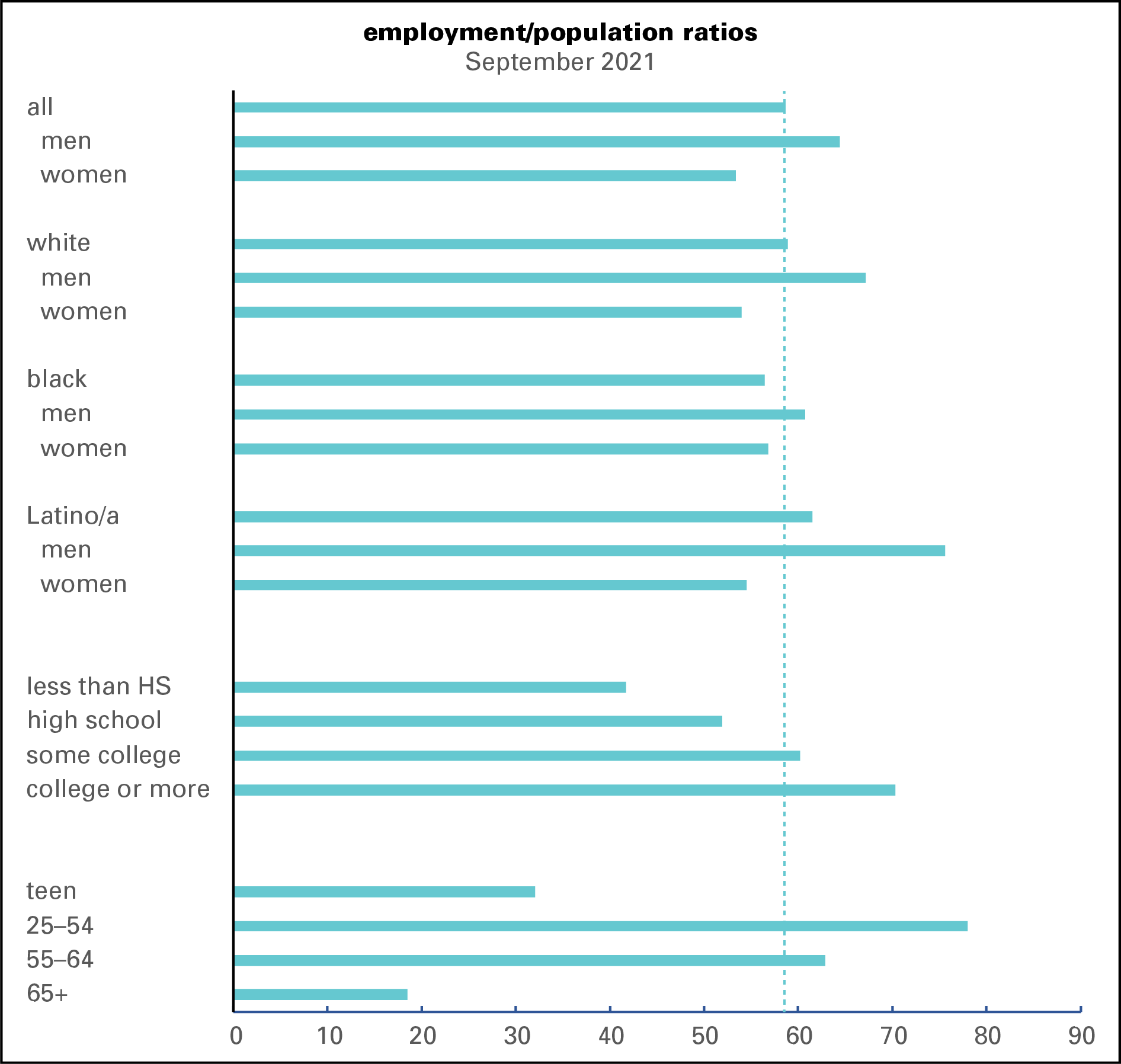
Loss and recovery rates don’t say anything about levels, and EPOPs very widely by demographic as the next graph shows. The vertical dotted line marks the overall employment rate of 58.7% in September. Men are above it and women are below. The most employed demographic in the race/gender/ethnicity grouping is Latino men, at 75.6%. White men are a distant second, at 67.2%. At 54.0%, white women are the least employed group. By education, the stairstep correlation applies again, with the EPOP rising with each level of attainment.
Why does the recovery remain so incomplete? Many employers, especially in restaurants and retail, went out of business, and workers have no place to return to as the crisis eases. People are still reluctant to go to restaurants and hotels. Hotels were at 61.6% of capacity in September, down from 67.2% in September 2019. Restaurants were operating about 9% below 2019 capacity in September. Retail foot traffic hasn’t fully recovered either. Some employers are still uncertain about the future and unwilling to commit themselves to hiring permanent staff.
And workers remain notoriously reluctant to take any crappy job that comes along. A survey by the Indeed Hiring Lab found just a third of the unemployed actively searching for work, little changed from June. You can’t blame pandemic-expanded unemployment insurance benefits for that reluctance anymore either—they’re now gone everywhere, not just in Republican-run states.
You have to wonder how people are paying the bills. Some aren’t, for sure. But the latest edition of the Federal Reserve’s distributional financial accounts, which look at the financial status of households at various levels of the wealth distribution, found that at the end of the second quarter, they had almost $3.5 trillion in checking accounts and cash, $2.4 trillion more in than they averaged in 2019. The top 1% unsurprisingly accounts for a lot of the increase, but other segments of the distribution are flush as well. Even the bottom 50% was packing some reserves, with an average of $3,744, or 78%, more than their 2019 average. The next 40% has $11,405 more, two-and-a-half times as much. Much of that is no doubt the lingering result of stimmy checks and other covid supports. That’s certainly not enough to fund a life of leisure, but it can sustain a few months’ pickiness—especially if you have an employed spouse or partner (a factor cited by a third of respondents in the Indeed survey).
It looks like the economy is experiencing something like long covid too.

