
Yanis Varoufakis on Larry Summers
More Larry Summers content. with him much in the news as a Biden adviser.
Determined to delay the serious business ahead of us a few moments more, I signalled to the bartender for a whiskey of my own and said, ‘Before you tell me about my “mistake”, let me say, Larry, how important your messages of support and advice have been in the past weeks. I am truly grateful. Especially as for years I have been referring to you as the Prince of Darkness.’
Unperturbed, Larry Summers replied, ‘At least you called me a prince. I have been called worse.’
For the next couple of hours the conversation turned serious. We talked about technical issues: debt swaps, fiscal policy, market reforms, ‘bad’ banks. On the political front he warned me that I was losing the propaganda war and that the ‘Europeans’, as he called Europe’s powers that be, were out to get me. He suggested, and I agreed, that any new deal for my long-suffering country should be one that Germany’s chancellor could present to her voters as her idea, her personal legacy.
Things were proceeding better than I had hoped, with broad agreement on everything that mattered. It was no mean feat to secure the support of the formidable Larry Summers in the struggle against the powerful institutions, governments and media conglomerates demanding my government’s surrender and my head on a silver platter. Finally, after agreeing our next steps, and before the combined effects of fatigue and alcohol forced us to call it a night, Summers looked at me intensely and asked a question so well rehearsed that I suspected he had used it to test others before me.1
‘There are two kinds of politicians,’ he said: ‘insiders and outsiders. The outsiders prioritize their freedom to speak their version of the truth. The price of their freedom is that they are ignored by the insiders, who make the important decisions. The insiders, for their part, follow a sacrosanct rule: never turn against other insiders and never talk to outsiders about what insiders say or do. Their reward? Access to inside information and a chance, though no guarantee, of influencing powerful people and outcomes.’ With that Summers arrived at his question. ‘So, Yanis,’ he said, ‘which of the two are you?”
Instinct urged me to respond with a single word; instead I used quite a few.
‘By character I am a natural outsider,’ I began, ‘but,’ I hastened to add, ‘I am prepared to strangle my character if it would help strike a new deal for Greece that gets our people out of debt prison. Have no doubt about this, Larry: I shall behave like a natural insider for as long as it takes to get a viable agreement on the table – for Greece, indeed for Europe. But if the insiders I am dealing with prove unwilling to release Greece from its eternal debt bondage, I will not hesitate to turn whistle-blower on them – to return to the outside, which is my natural habitat anyway.’
‘Fair enough,’ he said after a thoughtful pause.”
“Powering through the watery curtain in pristine solitude, I took stock of the encounter. Summers was an ally, albeit a reluctant one. He had no time for my government’s left-wing politics, but he understood that our defeat was not in America’s interest. He knew that the eurozone’s economic policies were not just atrocious for Greece but terrible for Europe and, by extension, for the United States too. And he knew that Greece was merely the laboratory where these failed policies were being tested and developed before their implementation everywhere across Europe. This is why Summers offered a helping hand. We spoke the same economic language, despite different political ideologies, and had no difficulty reaching a quick agreement on what our aims and tactics ought to be. Nevertheless, my answer had clearly bothered him, even if he did not show it. He would have got into his taxi a much happier man, I felt, had I demonstrated some interest in becoming an insider. As this book’s publication confirms, that was never likely to happen.
Larry Summers, 2000 vintage
With Larry Summers in the news as a Biden advisor, a check out this recounting of my encounter with him in April 2000.
Forced binaries, etc.
I’ve been hating on the Democratic party in public for almost 35 years, in private for longer than that. But I have to say, and I don’t see how anyone could deny this, if a Democrat were president now there just wouldn’t be anywhere near as many dead and doomed people. The CDC might not have been richly funded, but it certainly wouldn’t have been eviscerated, with talented people not wanting to go anywhere near it. The pandemic task forces wouldn’t have been disbanded, and probably would have been listened to from fairly early on.
Given the choice between neoliberal technocrats and proudly ignorant yahoos, I have to go with the former. I’m not going to stop agitating for a world where we could have better choices, but as long as it’s a forced binary, as they say in the polling business, it’s an easy answer.
Sorry if this disturbs anyone. It sorta disturbs me. But you have to be honest with self and others.
Biden by 20
Based on historical patterns going back to 1948, Biden should beat Trump by almost 20 points in the popular vote. Of course, if anyone could blow this, it would be Biden.
Back in 1996, when I was still doing Left Business Observer, I came across a 1993 paper by Andrew Gelman and Gary King, “Why are American Presidential Election Campaign Polls so Variable when Votes are so Predictable?” It cited research showing that despite all the volatility in the opinion polls during the campaign, the results were fairly easy to foresee months in advance based on some fairly simple models.
Inspired by that paper, I developed my own version of such a model—and, given my statistical skills, it had to be a very simple model. It had just two inputs: the president’s approval rating and the yearly growth in real after-tax income per capita (aka disposable personal income, or DPI), both measured in the second quarter of the year before the election. It all worked surprisingly well. I’ve updated it a few times over the years with subsequent elections, and just ran the numbers for 2020, which is where the prediction of a Biden landslide comes from.
A few more details. The model predicts the share of the popular vote that “should” be earned by the incumbent party (which may or may not be an incumbent person) and by the challenging party. What’s shown below is the difference between the two, actual and as predicted by the model.
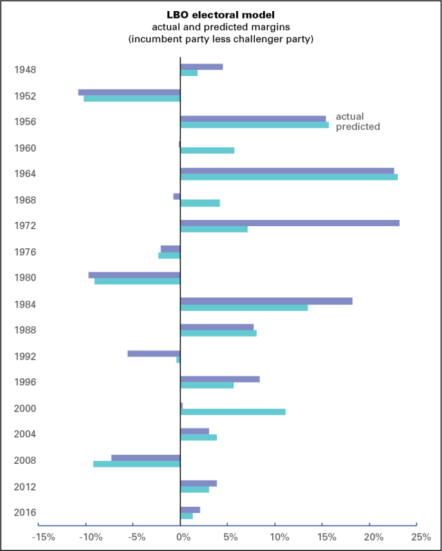
While it was sometimes off on the margins—though, all things considered, it’s pretty good—it still predicted the correct result in 16 of the 18 cases. The only ones it got wrong were 1960 (in which there were suspicions, never proven, of vote fraud to Kennedy’s benefit and Nixon’s detriment) and 1968, when the wily Nixon got his revenge by beating the hapless Humphrey.
At the bottom of this page is the history of the inputs and results. Approval is average Gallup approval rating for the president from April through June of the election year (which isn’t necessarily the approval for the candidate: for example, the 1960 approval is Eisenhower’s in the spring of that year, not Nixon’s); DPI is the yearly growth in after-tax income per capita for the second quarter, from the national income accounts; and margin is the difference between the incumbent party’s share of the popular vote and the challenger’s. The equations are shown at the bottom. As I said, it’s a simple model.
For 2020, I’ve used Trump’s current Gallup approval rating and an estimate of an 8% decline in real DPI per capita from a year earlier. Since the New York Fed’s GDP tracker is predicting an almost 11% decline for the quarter so far, -8% is a conservative estimate. It shows Biden beating Trump by close to 20 points, or a 60/40 popular vote. At 0%, which is virtually impossible, it still would have Biden winning by over 4 points.
I should attach some consumer warnings here. The model predicts the popular vote, so it called Gore the winner in 2000 and Clinton in 2016 (which, if we had a sane electoral system, they would have been). And 2020 is a completely wacko political year, featuring a lifeless challenger to a mad incumbent in the midst of a pandemic-induced economic crisis. But the conclusion here is that no matter how things look now, if we have an election, it’s Biden’s to lose, a formulation that admittedly may inspire more doubt than confidence in the prediction.
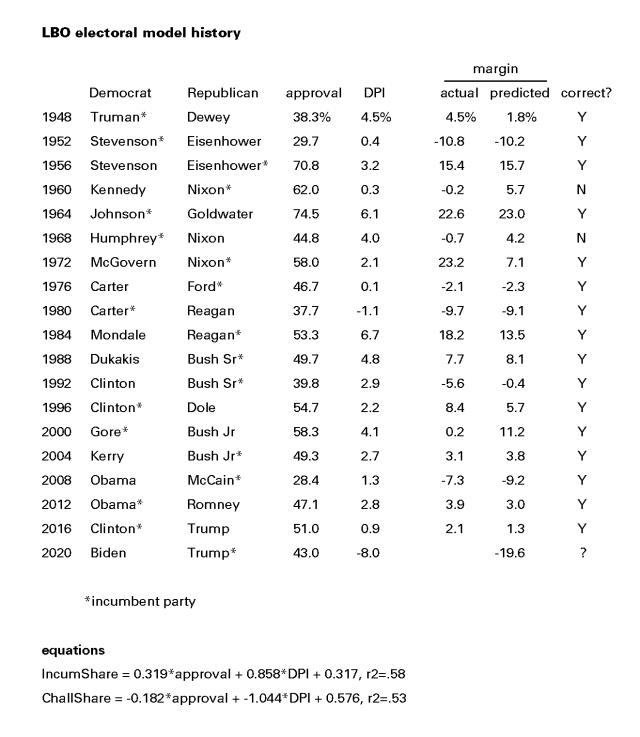
[Apologies that the table is a graphic and not text; WordPress is not table-friendly.]
Fresh audio product
Just added to my radio archive (click on date for link):
April 16, 2020 Yanis Varoufakis talks about life under COVID-19, the economic crisis, vultures stripping Greece, and democratizing the EU (includes bonus audio clip of Jim Cramer recalling his Trotskyist past)
Fresh audio product
Just added to my radio archive (click on date for link):
April 9, 2020 Jeb Sprague on CV19 in Haiti and the DR • Rossana Rodríguez- Sánchez on CV19 in Chicago and Puerto Rico • Josh White on the new leader of the UK Labour Party, Kier Starmer
Miserable employment report
This morning the Bureau of Labor Statistics reported that 701,000 jobs disappeared in March. Economists had been expecting about a third that number. Hardest hit were bars and restaurants, accounting for 60% of the loss. Also hit hard: retail, temp work, and, shockingly, health care.
One reason job loss expectations were relatively low was that the survey of employers on which the count is based is done during the week containing the 12th—in this case, between March 8 and 14. (No one is expecting anything but a torrent of bad news in the coming weeks and months.) As the graph below shows, survey week came before the surge in applications for unemployment insurance from 282,000 in the week ending the 14th (survey week) to 3.3 million the following week and 6.6 million during the week ending the 28th. It also came before the wave of stay-in-place orders, which began on March 20. Within a week, 20 states and 4 cities issued such orders. (There’s a helpful timeline here.) It’s striking that employers began shedding workers ahead of the closures, not a good portent for the April numbers.
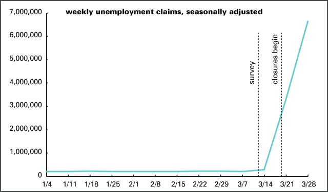
Expectations are that the unemployment rate, which rose 0.9 to 4.4%, will rise by at least 10 points and possibly 20 or more over the next month or two. The broad measure of unemployment, U-6, which accounts for discouraged workers (those who’ve given up the job search as hopeless but have looked in the past year) and people working part-time who’d like full-time work, rose 1.7 point to 8.7%. There is just no precedent for this rate of job loss.
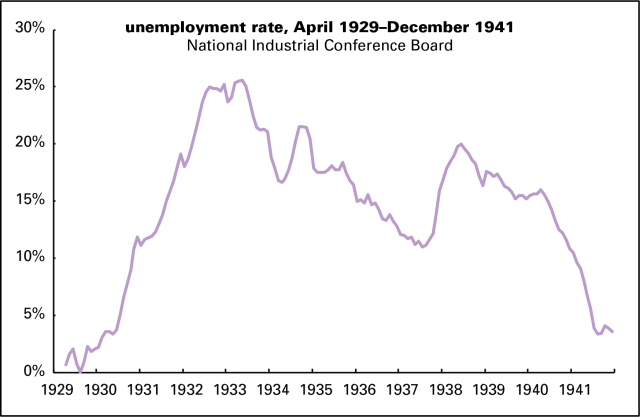
The monthly surveys of households, on which the official unemployment rates are based, began in 1948, so we don’t have good stats for the slide into the Great Depression. We do have highly unofficial monthly estimates of the unemployment rate assembled by the predecessor of today’s Conference Board, available from the National Bureau of Economic Research. Those are graphed below. At the time of the great stock market crash, October 1929, the jobless rate was 2.3%. A year later it was 9.0%. It took over two years to break 20%, finally peaking at 25.6% in May 1933. By some forecasts we’ll be there before summer.
Fresh audio product
Just added to my radio archive (click on date for link):
April 2, 2020 Dania Rajendra of Athena on the walkouts at Amazon • Lauren Kaori Gurley on the walkouts at Whole Foods and Instacart • J.W. Mason on the World War II economic mobilization as a model for a Green New Deal
The hits keep coming
Goldman Sachs attracted a lot of attention with its forecast that US GDP will be off 34% in the second quarter of this year. That is a very big number. It’s three-and-a-half times the worst quarter in US economic history since quarterly GDP stats began in 1947. (That quarter, by the way, was the first of 1958, the onset of a sharp recession, which featured, among other things, an “Asian flu.”) Here’s a little perspective on that number.
That 34% figure is annualized, meaning it’s what the total decline would amount to if the quarter’s rate were sustained for a full year. A 34% annualized decline works out to a 9.9% decline for the quarter alone.* Big, but at least it’s not a third.
Unless you’re a connoisseur of these things, though, you probably don’t know that we never fully recovered from the 2008–2009 recession. That point is made in the graph below. The line marked “trend” is based on the 2.1% average growth rate from 1970 to 2007, the year just before the Great Recession hit. The “actual” line is, as the name suggests, reported GDP per capita. The Goldman Sachs estimate for the second quarter is marked with the dot. If something like that forecast comes to pass, we will have undone the entire 2009–2019 recover/expansion cycle in a matter of months.

Note how from 1970 to 2007, the actual line bounces around the trend, rising above it in expansions (peaking around 1990 and 2000, for example), and falling below in recessions (like 1975 and 1982). Actual never strayed far from the trend—until taking a sharp tumble in 2008 and 2009, from which it never really recovered. Since 2009, the growth rate has averaged 1.6%. Last year, which Trump touted as the greatest economy ever, it managed to get back to the pre-2008 average of 2.1%, an average that includes two deep recessions (1973–1975 and 1981–1982).
At the end of 2019, actual was 13% below trend. At the end of the 2008–2009 recession it was 9% below trend. Remarkably, despite a decade-long expansion, it fell further below trend in well over half the quarters since the Great Recession ended. The gap is now equal to $10,200 per person—a permanent loss of income, as economists say. That doesn’t translate literally into a loss of $10,000 in personal income; there are lot of other things in GDP, like investment. And gains in personal income have been concentrated in the upper brackets for several decades, so that doesn’t mean the average American is $10,000 poorer than they would be had the economy recovered normally after 2009. It does mean we have a lot less in the way material resources than we should. And it suggested there were serious pathologies underlying a superficial and often strange “prosperity.”
That’s all gone now. Regardless of the exact number, we have almost certainly entered a very sharp downturn, one that could rival or exceed that of the early 1930s, though at a much faster tempo. We could experience in months what took three or four years to unfold after the 1929 stock market crash.
Goldman is expecting a rapid recovery later in the year. I find that hard to believe. A shock like covid-19 isn’t easily recovered from. Even if we find our footing in two or three quarters, we’ll probably see another permanent income loss, unless we undergo some serious structural reforms.
Yes, GDP is a flawed measure of material well-being. It says nothing about what the economy produces, at what human and ecological cost, or how it’s distributed. But GDP is a useful shorthand for the principles around which our society is organized. This analysis helps explain why things have felt so unsatisfying despite cheerful economic headlines for the last five or seven years. And it’s only going to get worse, and probably a lot worse.
*Normally, you can annualize a quarterly rate by just multiplying by 4, or “quarterize” an annual rate by dividing by 4. Such approximations are close enough with the small percentages associated with the ups and downs of US GDP. When the numbers get large, however, that trick doesn’t work because of compounding. The formula to compute the real quarterly rate from the annual one is ((1+-0.34)^(1/4))-1, which yields -9.9. Or, if you want to annualize -9.9, it’s ((1+-9.9)^4)-1, which yields -0.34. For simplicity’s sake I’ve omitted the percent sign.
Fresh audio product
Just added to my radio archive (click on date for link):
March 26, 2020 James Meadway on the economic dimensions of the coronacrisis (article here) • David Quammen on zoonotic diseases like covid-19, which leap from animal to human and wreak havoc
Unemployment claims surge
Last week, 3.3 million people* applied for unemployment insurance. That’s five times the previous record weekly number, a series that goes back to 1967. Compared to monthly averages and expressed as a percent of employment, which is how it’s shown in the graph below, that’s over two-and-a-half times the previous record.
As of the previous week, 1.8 million people were drawing unemployment insurance, so the number of new claimants is almost twice the number already on benefits, or 182% as many, to be precise. That ratio has never exceeded 26% before.
This surge is unemployment is unprecedented in both scale and speed. And this is only the beginning.
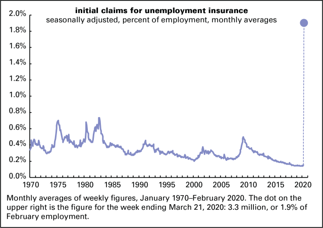
*That’s after seasonal adjustment, which attempts to compensate for regular fluctuations in the number from week to week. Before adjustment, 2.9 million actual humans applied. Seasonally adjusted figures are the standard way of looking at this and many other economic series, which is why I’m featuring it and only making this geeky observation in a footnote.
Explaining the rot
In my article about fighting the coronavirus and economic crises yesterday, I said:
We also need to invest in the physical and social infrastructure of this country. For decades, civilian public investment net of depreciation has hovered just above 0, meaning that we’re doing little better than replacing things as they decay.
Here’s some more detail on that, which updates a September 2017 post.
Graphed below are histories of net public investment in the US, from the national income accounts. (The source is table 5.2.5, here.) “Net” means after accounting for depreciation, aka wear and tear. And public investment means government expenditures on long-lived assets like buildings, equipment, and roads. Not all of such expenditures are good. Prisons are in there, though they’re only a small portion of the total. But a robust public infrastructure is a foundation of a civilized life, and, as you can see, we’ve done little to build that foundation. It shows in collapsing bridges, dilapidated schools, and glaringly now, almost no public health system.
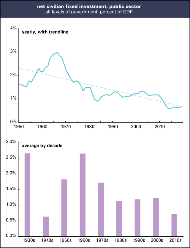
(I started the yearly graph in 1950, not 1929 when the national income accounts begin, because the figures for the Great Depression and World War II years would be distracting, but they’re captured in the decade averages.)
The New Deal saw a boom in public investment, creating an infrastructure we still use—bridges, schools, post offices, parks. (For details, see the Living New Deal site.) World War II resulted in a severe squeeze on public investment, taking it down from a peak of 3.2% of GDP in 1939 to zero and less during the war years. It recovered in the 1950s, and by the mid-1960s, came back almost to 1939 levels. That’s when the US was building schools, public universities, and the Interstate Highway system. (It wasn’t just federal spending—state and local governments were active builders as well.) It began falling in the 1970s and continued to fall in the 1980s and 1990s, the time of Reagan’s “government is the problem” and Clinton’s “the era of big government is over.” It stayed flat in the early 2000s, and in stark contrast with the 1930s, fell during the Great Recession and its aftermath. The reaction to that crisis, which took unemployment up to 10%, was austerity, not expansiveness. Public investment has ticked up slightly since, to 0.7% in 2019, which is also the average for the decade. That average is only 0.1 point above the 1940s, the years of world war.
It’s not just the federal government that’s been retrenching—it’s state and local as well. The 0.7% average for the decade is the sum of 0.6% at the state and local level and 0.1% at the federal. In other words, the federal government is barely keeping up with its infrastructure as it rots.
We badly need to turn this around with investments in old-fashioned things like schools as well as new ones, like clean energy generation and high-speed rail (which the private sector isn’t likely to produce on its own). A Green New Deal, in a phrase.
Fresh audio product
Just added to my radio archive (click on date for link):
March 19, 2020 David Himmelstein of Physicians for a National Health Program and CUNY on how US health policy got us to this desperate pass • Helen Yaffe on Cuban interferon and COVID-19, and the country’s biotech industry and health system (YUP article here)

